The most accurate image of a black hole created to date was created for the 2014 film Interstellar, by a team of over 30 people including an expert theoretical physicist. Creating the image required over 800 terabytes of data to be processed.
Big Data
18.5. Visualisation
Much of the information absorbed by a sighted human's brain is visual, and hence we are not very good at processing large amounts of raw data in numeric or text form. We often need something visual to represent data to help us understand it. "Data visualisation" means graphically representing data, to try and convey information about data in a way that is easier for us to interpret. This is an important method that we can use to help us find patterns, trends or correlations that might not have been identified otherwise. To see some examples have a look at the website Information is Beautiful, which contains a huge number of data visualisations.
One particularly interesting data visualisation application is Astronomy. Did you know that a lot of the beautiful images of space that space agencies release are not "real" images? They are actually works of art created by visualisation scientists, not simply photographs taken with a telescope. The reason for this is because the telescopes used by astronomers mainly collect raw data rather than images. Visualisation scientists use this data to create a hypothetical image of what something looks like. This isn't to be confused with 'just making things up'! The images they create are based on the real raw data and their own in-depth knowledge.
Accurate Images of Black Holes Curiosity
Data visualisations are all around us. As long as something takes some data and turns it into something visual, it is technically a data visualisation. Chances are you have even made some yourself! Some interesting examples include:
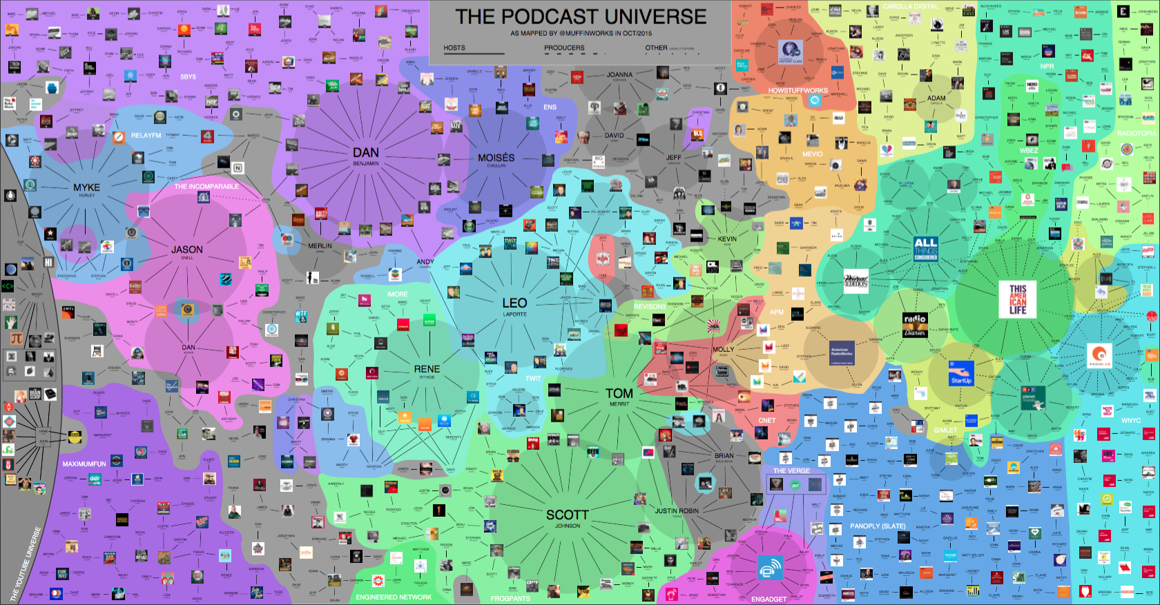
- In 2015 @muffinworks made a visualisation of the "Podcast Universe" to summarise how all the different podcasters, producers and networks are related to each other.
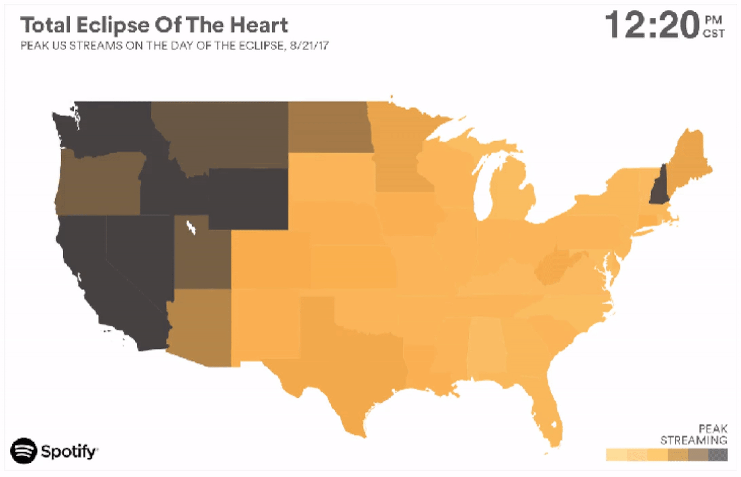
- Spotify published an animated map showing how many times the song “Total Eclipse of the Heart” was streamed across the US during the Eclipse of August 2017.
- A very early example of a data visualisation is something you have probably seen in a science classroom, The Periodic Table. Although it’s not "Big Data", it is a great example of taking textual data and making it more interesting, while still being useful by using rows and columns to group different elements, along with colours to represent different attributes.
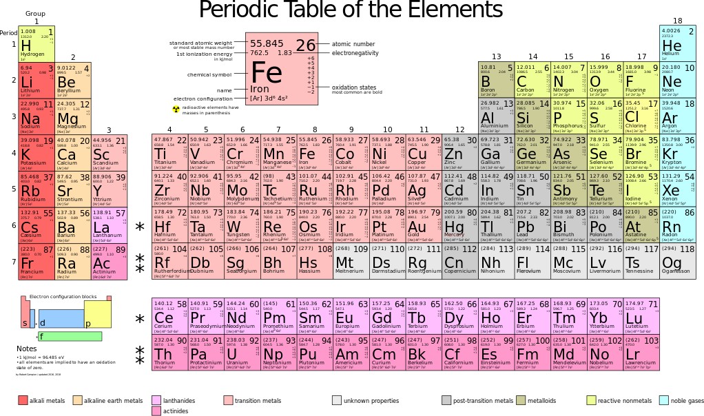
All of these examples use different techniques to display data in a way that we can easily understand. It is much easier to glance at the Periodic Table to check which elements are noble gasses by using the colour codes than it is to read it in a line of text.
You can also check out some different visualisations showing New Zealand data at figure.nz and infographics published by Stats NZ.
Periodic Table of Data Visualisation
And for the particularly keen, there's even a Periodic Table for Data Visualisation methods!
Visualising big data is all about choosing a technique that conveys the ideas, trends, or patterns in the data that you want to understand, or help others understand. For example, if you are looking at the trend of a relationship between two variables over time, often a simple line graph would be suitable. But obviously the visualisation becomes more and more complex as the number of variables you’re examining grows. The most important part however, is that the visualisation accurately conveys the data in a way that allows the viewer, or user, to draw information from it, and it is not misleading.
Investigate how different visualisation techniques can be more useful than others with the data visualisation interactive: